Wabi-Sabi tile fragments

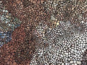
When deepening my knowledge about Wabi-Sabi, I realised that this concept best relates to the artworks in which I use eroded tile fragments, like “Australia – Italy carpet”, “Divisions are Arbitrary”, “Broken Heart” or “White corner”. The idea is to compose a piece with hundreds of pieces of recovered tiles of demolished buildings, eroded by the sea, juxtaposed horizontally and given new meaning.

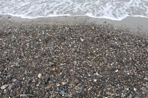
Wabi-Sabi is a multifaceted complex Japanese aesthetic concept where wabi refers to nature, simplicity, sadness and assymetry, while sabi relates to something old, altered by time or acquiring patina. This is exactly what the fragments of tiles that I use in my artwork are. Nature has provided their terracotta basis. The rolling waves on the pebble shore has softened the tile’s edges over time. Each small tile fragment, coloured or not, is an almost insignificant object but it carries a strong sad story; building demolition material is being illegally dumped in the Mediterranean sea. The desegregation of the glaze with which the tiles are covered contaminates the water through the release of lead. But these small insignificant fragments also carry humble beauty. They are eroded by rolling among the pebbles of the shore, which modifies their irregular shape, often into an almost organic rounded one. If the tiles still comprise a coloured stain, their original colour will have been softened, slightly whitened by the salt contained in the sea water. This gives the overall result a less bright look. It seems like some white was added to the colour of the tiles. The traces of time are very visible on these human-made objects which get gradually transformed into small rounded pieces of terracotta that are easily taken for an ordinary pebble on the beach. 


And so, beauty emerges from the unexpected. From a temporary state between human-made bathroom or kitchen tiles covering a wall or floor in the house, and a little piece of terracotta uncontrollably shaped by the sea, forgotten among the shore pebbles and uniting with them. Through erosion the tile fragments evolve towards disappearance. In their original state, tiles are mass produced with square angles and standard sizes. When I pick up eroded fragments they are irregular and often imperfect, but that’s where their beauty emerges, they are diverse and have all become unique. They have evolved from a standardised surface to a unique extraneous fragment. I feel that their imperfection symbolises freedom, while their initial industrial perfection symbolises norms and a sort of one-size-fit-all authority. The tile fragments have lost functionality and utility but are charged with so much sensory information. By looking at them closely, observing their colour or their decorative pattern, one discovers subtle traces of beauty. Decontextualised, ugliness can be poetic.

The artworks that I make with the eroded tiles are all temporary as they are assembled for a given exhibition and dismantled afterwards. Every time that they are re-assembled they will look different and tell another story. A question then emerges “what is the original version of the artwork”?, and if I may attempt an answer, it would be that “the process is always identical, never the end result”.

My ‘calligraphies’

Calligraphies were born worldwide from the necessity to communicate through writing. In multiple regions and over time they have taken different forms. Curved or angular lines with letters attached or separate, brushstrokes, geometric shapes, small hand painted symbols, logos, calligraphies come in endless variations. These variations are often specific to the writer, so that a given handwriting can almost lead to the identification of its author. It is used by graphologists to point to traits of a person’s character.

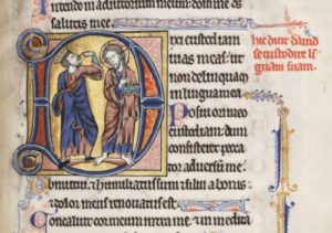
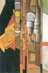
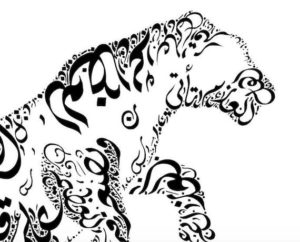
Art and calligraphy have always walked hand in hand. In the Western world during the Middle Ages, the first letters of religious texts were decorated with illumination. In traditional Chinese poetry, painting and text are indissociable and appear together on the same scroll. Cubism, modern and contemporary art have widely used text, interwoven with painting. Letters or words can be laid out on the surface where they are written to form a shape, an object, a landscape or something else. This is very common in Arabic calligraphy. These are only a few examples but the practice of mixing letters, words and sentences with drawing and painting, is widespread in so many cultures.

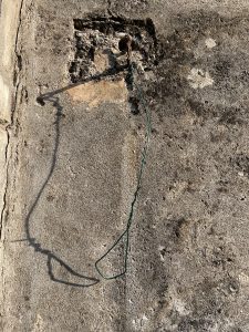
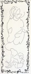
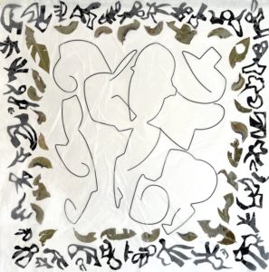
‘My’ art calligraphy mostly starts with a line, made of metal wire which I bend. The lines do not come in recognisable shapes and do not represent anything. They comprise curves and angles, one or more, are big or small, long or short. Usually the lines are inspired by nature. Broken horizon lines, enlarged natural shapes, movements of branches. The lines in front of me are never less than thirty. I then start creating a composition, assembling several pieces. Some lines will be touching one another in a given point, others stand alone. I try to create movement, a flow; visual balance that produces a sense of harmony. The wire that I use is rigid but the aim is to be fluid.

A Chinese calligrapher once told me that very few people are able to read cursive Chinese. Therefore, when they look at a page in cursive script, they try to feel the writer’s emotions and look at the general shape of the page which they personally interpret. Maybe it is this consideration that led to my ‘calligraphies’. They are asemic as they have no specific meaning but reflect a state of emotions that can be tensed and intense or light and open. Do they help ask new questions or enable to see things differently?

The brain metaphor

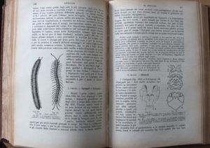
When I found a zoology treatise on an Italian flea market, I knew how to give it a new life. The illustrations of the 1928 book would be transformed or included into pictures with a new meaning.

Books with right and left pages are like brains with right and left hemispheres. To push the metaphor a little further, I considered that the left part of the book would reflect the more, rational, structured and linear elements. That’s where I would write short four-word poetry, mainly composed of single syllable words. Like mini-haikus, without rhyme but with an acoustic flow of sounds and a partial meaning that the reader can expand, imagine or reshape.


The pages on the right hand side of the treatise contain spontaneous, artistic and emotional elements that are somehow linked to the poetry on the opposite page but would leave room for bridging to new connections.

The treatise was originally written by the German zoologist Richard Hertwig. The version that I am working with is it’s Italian translation, whereas my mini-Haikus are in English, French and Dutch. Imagination without borders.


Extreme tensions

Experimenting with the resistance of material is most fascinating. When mixing metal and paper a tension is created because metal is heavy and the paper that I use only weighs 9 gr./sqm.

Recently I have experimented another type of resistance, namely that of thin Kozo paper on which I heavily apply strong, almost violent strokes of black graphite stick. At times the paper doesn't resist. But when it does the contrast between the fragile paper, the light colour patches and the dark strokes gives me positive emotions.

Harmony can emerge between materials that seem so distant and were not intended for living together. Isn't this also the story of East meeting West.

Connecting cultures

Since my childhood I have lived in the presence of this model of a tongkonan, the typical house of the Toraja in South Sulawesi. My father used to regularly travel to the area to buy and export spices from the harbour of Makassar. He received the model tongkonan from one of his providers.
Tongkonans’ architecture is unique with stilts and a saddle-back roof that provide a kind of rhythm to the building. Decoration is abundant, including painted motifs and a carved buffalo head on the facade, symbol of prosperity and ritual sacrifice. It all looks very well integrated in the local environment and culture.


During last week’s visit at the Maeght Foundation in Saint-Paul-de-Vence, I was also struck by the architecture that was perfectly matching the Mediterranean context. Josep Lluis Sert perfectly translated Aimé Maeght’s intentions. The presence of light is essential inside the building as well as in the outdoor courtyards and gardens. The space is rich in sensorial stimulations, both natural and man-made: shapes, colours, sounds, perfumes, textures and of course the wonderful collection of modern and contemporary art.

The white roof of the main building reflects the sunlight. I look up towards the trees and the sky. The two thin curved sheets of concrete are stunning and evoke the horns of a bull.

Miro’s sculptures are nearby.

Are bulls a regional archetype? They were no doubt one of Picasso’s preferred subjects. His 1942 Bull's Head made of a bicycle saddle and handlebar inevitably connects with the buffalo head on the tongkonan.