Fascinated by the Oriental cultures I wanted to create another piece that conceptually bridges East and West. I decided that calligraphy would be the common denominator.
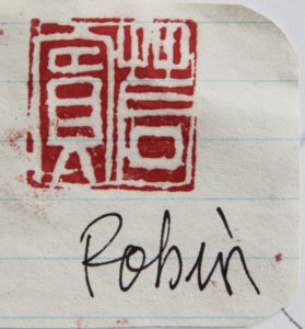
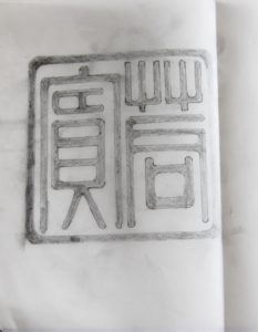
A Chinese friend and calligraphy artist offered me a stone seal with my name carved in old Chinese characters. He used the intaglio technique on a surface of 2.2 x 2.2.cm.

With intaglio, the letters appear white while the background is coloured.
The ink is a mix of cinnabar and oil.
My friend helped me decipher the printed and enlarged version of the seal which I had inserted in my sketchbook. As I wanted the end result to be black characters on a white background, I used tracing paper to invert the white into black letters.
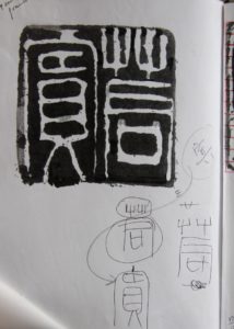
The drawing obtained was enlarged to the dimension of the final piece (90x90 cm).

I could now start producing the artwork.
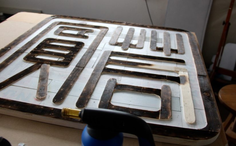
The sides of wooden fruit and vegetable crates with words printed in the Latin alphabet would form the perfect background. Italy and China share another characteristic; they both have great food. Crates that serve to transport and trade food -and tea in China- were used as a metaphoric representation of this.
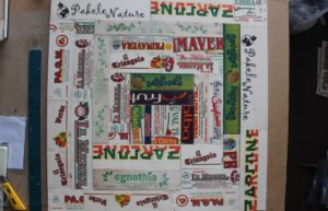
But I wanted the background to be looking white, with the letters subtly coming out. Viewers’ initial impression should be to see black Chinese characters on a white background, and only by looking closer or longer would they see that that background reveals words written in Western calligraphy. So the background was covered with several layers of diluted white paint.
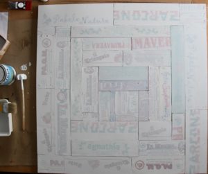
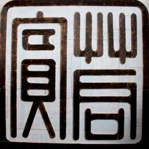
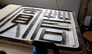
The Chinese letters were reproduced in wood and nailed to the background to form the final shape of the piece.

I used fire to colour the wooden letters in black; this produced the soft and nuanced result which I was looking for.

And here is the final artwork.